
As of 2020, mobile commerce spending is 31% of total retail eCommerce spend. If you want your website to be successful in the near future and beyond, it’s important that you take notice now before it becomes an issue. All users should have a great experience when using your website. Your site must look good and be easy to use on any device, including computers or mobile devices like smartphones and tablets.
To make your mobile ecommerce website more user-friendly and accessible on mobile, we’ve put together a list of action items you can complete.
What’s in it:
- Make your website friendly on mobile phones
- You will need to evaluate your page speed
- Make it easier to find things on your website
- Choose content that will be seen first
- Personalize the experience for the mobile
- You need to update your pop-ups
- Provide a way for guests checkout
- Install ChatBot on your website
- Conclusion
- FAQs
Make your website friendly on mobile phones
When you get ready to start working on your website, make sure it can be accessed easily by mobile phone users. To do so, simply run Google’s Mobile-Friendly Test and input the URL of your site right into their interface. They will then assess its level of compatibility with different smartphones or tablets – which is especially important for when people decide to use a connection other than WiFi!
Google wants your website to be mobile-friendly. They provide a list of things you can do with their handy Mobile-Friendly Checker, such as compressing images and reducing redirects.
You will need to evaluate your page speed
If your site takes more than three seconds to load, Google will consider it slow and may rank you lower on the SERP. To avoid this happening, use their PageSpeed Insights tool for a comprehensive analysis of how fast your page loads.
Here are some tools where you can check your page speed & get how to improve feedback as well:
The page speed of your website is measured by how fast it loads on desktop and mobile devices. Once you input the URL, a numerical result will be provided based off of 0-100 with 90+ being sufficient for webpages to load quickly.
Make it easier to find things on your website
Navigating your website is critical for both customers and the business. Visitors use a navigation menu to go to all areas of your site. If they can’t find what they’re looking for, then you will lose them.

Mobile website navigation is the key to easy browsing and a good user experience. A good website is easy to understand and people can find what they are looking for. It should be simple, clear, organized, and lead visitors where they want to go quickly.
You should design for small screen sizes when designing or redesigning your mobile navigation. A responsive site will adjust to fit any device. You need to decide which links you want to have on the site first, and then design the rest of it around them.
With the rise of mobile browsing, it has become more important than ever to have a search bar available. Not only will this make your site easier and faster for visitors on their phones, but you can use what people are searching for as an opportunity to create content that moves with them!
Choose content that will be seen first
Website visitors make snap judgments about whether to stay or go. These decisions are often based on what is “above the fold”, which means that content should be interesting and engaging enough in order for a visitor not to scroll down, but instead click away out of boredom.
The above-the-fold content is the first thing that captures a visitor’s attention. Use this space to grab their attention, display your brand’s personality, and introduce them to a call to action (CTA). Place your most critical information there as it will be of more use than flashy banners or promotional images.
Personalize the experience for the mobile
Websites are constantly collecting data about us as we scroll through the internet, and in return for this information, they give us a highly customized online experience. However some marketers have found that personalized content can do much more than simply meet customer desires- it has an ROI of $3-$5 per dollar spent on customizing these messages!
Deliver a tailored shopping experience by offering personalized recommendations on different pages of your mobile website. Here are some tips to consider:
- Offer a coupon code that is only valid once per new mobile shopper.
- You can make your store more personal by customizing the pages for each person. For example, show items that someone has looked at in the past or where they live and what they have bought in the past.
- Remind customers of items in abandoned carts and get them back with a push notification for the store.
- For more convenience, provide your customers with a list of their favorite items from previous purchases.
You need to update your pop-ups
Pop-ups are one of the most recent and popular trends in sites. You may not know how to add a pop-up on your mobile site, but that is what we’re here for! We’ll tell you about some things that will help when it comes time to make this decision.

The pop-up must comply with Google’s regulations, as it will rank your website lower in search results. For example, ensure the pop-up doesn’t take up the entire mobile screen; If you do this, other pages of your website may not be accessible from there. Google may also ban you from spamming.
It’s important to offer a personalized experience and avoid bombarding customers with the same pop-ups. For example, if you follow one of our requests for an email list subscription on site A, we want it to be clear that when returning from Site B or C as well (or any other company) there won’t be another request because this is about avoiding confusion!
Make sure you keep the copy short and, if it’s a form, only ask for information related to the CTA. If someone wants to sign up for your newsletter, all they need is their address and maybe their phone number. Make sure not to ask them for too many things on the form so that people won’t get frustrated!
Provide a way for guests checkout
Offering a guest checkout option is the first step towards simplifying your mobile shopping experience. A majority of e-commerce sites have already taken this necessary precaution, and with 2020 rapidly approaching, it’s more important than ever to capitalize on these opportunities for growth!
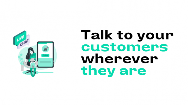
Install ChatBot on your website
Do you know why we need to Install ChatBot on the Website?
The potential benefits of chatbots range from cost savings associated with reduced agency staffing to the ability of a business to respond immediately to potential customers. With all this going for chatbots, why wouldn’t you want to integrate one on your site? Below are a few reasons why you need to Install ChatBot on your Website:
Chatbots are not only used as an alternative communication channel but can also be used in a variety of other ways such as running A/B tests or tracking user behavior.
One of the most common reasons why Install ChatBot on the Website is to reduce operational costs.
Businesses will be able to conduct customer support with their team of few members rather than hiring a huge number of staff to deal with customers.
Here is our chatbot solution PineChatBot, Which you can try for free.
Conclusion
Nowadays consumers are increasingly using mobile devices to access the internet. It is important to make sure that your website can be seen on phones. People who don’t have computers might want to look at them and see them. Fortunately, this guide offers valuable advice that will help you optimize your own website or app and make things easier for all of these people seeking information from their phones!
FAQs
An e-commerce store is an internet-based store that deals in the sale of goods or services, typically to customers outside of the brick and mortar location.
Creating your own online store nowadays is easier than it has ever been. One of the most important factors is the niche you are looking to sell in. It is worth considering what sorts of items would be popular online, whether they are handmade or mass-manufactured, and how likely people are to search for them or browse your website for specific products.
A well-optimized website is a way to go when it comes to search engine marketing (SEM). Mobile ecommerce websites experience difficulties in generating revenue, retention rates, and marketing conversion. This is because they lack the necessary tools for successful browsing with limited screen real estate.
The mobile ecommerce experience can be improved with a few simple tweaks including designing a fluid way for a user to navigate between categories, browse within each category, and then complete checkout. This will increase conversion rates and ultimately close the loop from marketing strategies generating sales back through proven channels of distribution which provides visibility into campaign effectiveness.